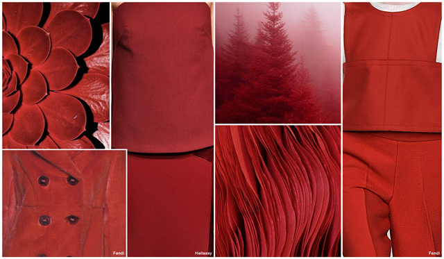
FV contributor, Mirella Bruno is a Fashion Print Trend Graphic Designer currently living in the French Swiss Alps. She curates an insightful forecast of mood boards for print, graphic and color direction. You can see her work on mirellabruno.com.
Our picks for this week are Fruit Sorbets, Geo Zen and Seashell Slipper for the S/S 2017 season.
FRUIT SORBETS
GEO ZEN
SEA SHELL SLIPPER
Popular Posts
-
Patternbank is an exceptionally great resource with over 20 years in the print, graphics and fashion industry. Their global research brings...
-
MICRO TREND - SS 2017 MONOCHROMACITE Norm Core color combo Black and White continues to be one of the leading palette use...
-
Promostyl is a trend service providing a global view of trends, fashion and design. To learn more, go to their website Promostyl.com . H...
-
The Woolmark brand is the world’s best-known textile fibre brand and is owned by The Woolmark Company , the world’s leading wool texti...
-
Trend Council is a fashion trend forecasting company who delivers expert analysis and design inspirations . Their team provides a great we...
-
Texworld an international trade fair for fabrics, trims and accessories is one of the largest sourcing event in the world for apparel fabri...
-
FV contributor Laura Luchtman from Kukka [INSPIRATIONS + PRINT ] series . Laura's background is in the field of Surface/Textile Design...
-
The International Textile Repor t is an extensive trend information for the whole textile and fashion market, published in the run-up to the...
-
The Indigo show is a creative textile and surface design show which shows 3 times a year the top international design studios, bookshop...
-
Love, love, love this denim dress! The halter-neck that frames in the shoulder part, gorgeous low cutback, a perfect frayed hem and practica...
Showing posts with label Colors. Show all posts
Monday, August 31, 2015
Wednesday, August 26, 2015
TRENDS // TREND COUNCIL - TIBET . S/S 2017
Trend Council is a fashion trend forecasting company who delivers expert analysis and design inspirations. Their team provides a great wealth of consulting services for all your company's design needs. Trend Council focuses on the Ladies, Juniors, Mens, Young Mens and Active markets. To learn more about their services, go here.
Here is a preview of their latest - Tibet - S/S 2017 season.
Tuesday, August 25, 2015
TRENDS // PATTERN CURATOR - COLOR + PATTERN . SS 2016
FV contributor, Pattern Curator curates an insightful forecast of mood boards & color stories and we are thrilled to have them on board as our newest FV contributor. They are collectors of images and photos to offer print, pattern and color trends. Each of the boards curated is visually directional, relevant and trend-right. An amazing site for inspirations, check out their site here.
Our picks for this week are Organic Insulation and Handcrafted.
ORGANIC INSULATION
Our picks for this week are Organic Insulation and Handcrafted.
ORGANIC INSULATION
sources: atifabusamra.com, deborahbigeleisen.com, coutequecoute.blogspot.com.au, idreamofaworldofcouture.tumblr.com, irisvanherpen.com, blanc-pale.tumblr.com, nevertrustfaith.tumblr.com, juxtapoz.com, mcqueenadillo.tumblr.com
HANDCRAFTED
Thursday, August 20, 2015
TRENDS // DESIGN OPTIONS - WOMEN'S . A/W 2016-17
DESIGN OPTIONS is a Los Angeles based trend and color forecasting company, providing trends from a west coast perspective. As the only Los Angeles based trend and color forecasting company, Design Options is dedicated to bringing Southern California's unique aesthetic to the world. Its singular,cutting edge perspective, coupled with a comprehensive knowledge of the current marketplace, fuels the company's imaginative products and high-end consulting services. Go here to learn more about their services or contact them, here.
Here is a preview of their A/W 2016-17 palettes for Women's, Animal Instincts and Graphic Statement.
ANIMAL INSTINCTS
An intuitive and instinctual adaptation to a variety of habitats…Animal Instincts. Shimmery silver and light slate grey shades of uninhabited and wild at heart add intrigue to lithe fur trim and supple textures. Pearly white and onyx tones harmoniously mingle within intricate colorations of taupe grey. Platinum silver accentuates bold edges. A stylistic sixth sense…Animal Instincts.
GRAPHIC STATEMENT
Modern and bold…Graphic Statement. Outrageous orange and denim blue shades of unequivocal utterance and illustrative allegation accentuate subtle nuances of light yellow. Dark pastel blue and classic rosy pink saturations allow surreptitious ideas to unfold with ease and sensibility. Coral red and light orange displayed on a background of black and white adds a modernistic edge. Explicitly expressive and astute.
Thursday, August 13, 2015
TRENDS // FASHION SNOOPS - F/W 2016-17 COLOR FORECAST
Fashion Snoops is an online forecasting trend service that reports on color, design themes, key items, details, etc., for women, men, youth, kids, accessories, beauty, home, and culture. To learn more and subscribe to their services, go to fashionsnoops.com to view their amazing site.
Women's Color Forecast - F/W 2016-17
This comprehensive report explores the key women's colors and palettes for the Fall/Winter 2016/17. Below is a preview of their key color call out RUST. Go to our Trendshop here to purchase the online report.
Wednesday, August 12, 2015
TRENDS + EVENT // ISPO TEX TRENDS . F/W 2017-18 COLORS
ISPO Textrends is ISPO’s new platform for designers, product managers, and the media to discover the latest fabrics, fibers, trims, and accessories for sports, and outdoor apparel. Their exhibitions are held in Munich, Beijing and Shanghai. To learn more and to look up their next shows go here to learn more.
ISPO teamed up with internationally renowned trend experts to identify the textile trends and colors for Fall/Winter 2017/18 to show what designers and product managers are looking for to develop their upcoming collections. To view the full report, you can visit their site here.
The following trend will describe in detail what designers and product managers are looking for in order to develop their upcoming collections. Go here to see the full report and you can select the images below to view the images larger and in a slideshow.
ISPO teamed up with internationally renowned trend experts to identify the textile trends and colors for Fall/Winter 2017/18 to show what designers and product managers are looking for to develop their upcoming collections. To view the full report, you can visit their site here.
The following trend will describe in detail what designers and product managers are looking for in order to develop their upcoming collections. Go here to see the full report and you can select the images below to view the images larger and in a slideshow.
COLOR PALETTE FALL/WINTER 2017/18
Colors are an essential part of the textile business.
CLASSIC ACTIVE
The pivotal seasonal color palette of bestselling tones takes a brighter approach this season. Hues take on a more solid approach with a sharper and more intense appeal accentuated with increased neutrality from a range of gray tones complete with black and white.
HAZY DAZE
A crisp and sharp palette inspired by nature comprised of subtle tones that can also take on a more luminary and crystallized role through brighter yarns and finishes. This delicate palette is also enhanced through the surface appeal from ultra matt and powdery handles through to milky touch for enhanced base-layer applications.
JUMPIN'
An energetic offering of dense tones through to uplifting brights feature, there is a feel-good factor present. This color palette has a lot of mileage for the print sector as well as appealing to natural and synthetic offerings in altering the surface appeal. Black is a key component in enhancing the vibrant brights, this is about taking traditional tones to a new level.
WIZARDRY
Mystical and ethereal in delivery, this palette can be worked down through to a rich, matte appeal or worked up through a metallic and lacquered approach for a feel of luxury and gleam. There is a heightened sense of reworking rich and neutral tones in creating something new and exciting for the season.
MANGA MANIA
Pushing the boundaries of the color spectrum, the intense bright and synthetic tones of this palette can be taken even higher to a fluorescent level, screaming intensity and grabbing the spotlight. Geared towards the synthetic side of the textile sector, there is a renewed appeal and optimism as fantasy comes through.
Thursday, August 6, 2015
TRENDS // MIRELLA BRUNO - PRINT/GRAPHIC/COLOR INSPIRATIONS . AW 2016/17
FV contributor, Mirella Bruno is a Fashion Print Trend Graphic Designer currently living in the French Swiss Alps. She curates an insightful forecast of mood boards for print, graphic and color direction. You can see her work on mirellabruno.com.
Our picks for this week are Dada Jagged, Historical Memories and Tribal Jaxx for the AW 2016/17 season.
DADA JAGGED
Our picks for this week are Dada Jagged, Historical Memories and Tribal Jaxx for the AW 2016/17 season.
DADA JAGGED
HISTORICAL MEMORIES
TRIBAL JAXX
Wednesday, August 5, 2015
TRENDS // FV MICRO TRENDS - SPRING 2017 . MONOCHROMACITE
MICRO TREND - SS 2017
MONOCHROMACITE
Norm Core color combo Black and White continues to be one of the leading palette used in both fashion and interior. We think infusing it with a splash of neutrals, a color accent and textures will give it a new level of dimension and look.
Couleur Locale Marble Bowls | Model Soo Joo by Kevin Mackintosh for Vogue Italia Sept 2012 | Patternity/Bubble Repeat/Robin Broadbent
IMAGE SOURCES:
Zach DeSart Photography | Mary Katrantzou | Wout Werensteijn Paintings
Friday, July 31, 2015
TRENDS // PATTERN CURATOR - COLOR + PATTERN . SS 2016
FV contributor, Pattern Curator curates an insightful forecast of mood boards & color stories and we are thrilled to have them on board as our newest FV contributor. They are collectors of images and photos to offer print, pattern and color trends. Each of the boards curated is visually directional, relevant and trend-right. An amazing site for inspirations, check out their site here.
Our picks for this week are Saffron Spice and Sulfuric Acid.
SAFFRON SPICE
sources: leastlittlething.tumblr.com, breadwig.com, tisaneinfusion.blog58.fc2.com, neonscope.com, ragnar949.deviantart.com, thetextileblog.blogspot.co.uk, kent.pastperfect-online.com, orlakiely.com, flickr.com
SULFURIC ACID
Wednesday, July 29, 2015
TRENDS // PATTERN PEOPLE - PRINT + COLOR INSPIRATIONS - SPRING 2016
Pattern People is a surface design studio founded by designers Claudia Brown and Jessie Whipple Vickery. Their studio provides a collection of thousands of ready-made print designs available for immediate use on apparel, paper products, beauty packaging, accessories, interiors and more. They are also available for commissioned design and can develop to your project's specifications. Visit their site here, to browse their inspiration blog and shop tutorials, trend guides and designer tools.
Their Print + Color Overview for Spring 2016 which features 9 key print trends for Spring 2016 and includes tips and techniques for pattern designs and with over 150 inspirational images. Go here to order it now. Also, their new Print, Color and Trend report for the Winter 2016 season is also now available, go here to order it now.
Below are reposts from their blog - inspirational COLOR/PRINT mood boards by Sarah Baugh.
GALAXY
Intergalactic planetary.
Dom Sebastian | Mara Hoffman | Richard Allen Morris | Yves Scherer
Karin Ruggaber | Anna Bogatin | Mara Caffarone | Roland Mouret
Ease into that summer feeling with a sea of muted beach hues.
Thursday, July 23, 2015
TRENDS // MIRELLA BRUNO - PRINT/GRAPHIC/COLOR INSPIRATIONS . SS 2016
FV contributor, Mirella Bruno is a Fashion Print Trend Graphic Designer currently living in the French Swiss Alps. She curates an insightful forecast of mood boards for print, graphic and color direction. You can see her work on mirellabruno.com.
Our picks for this week are Geopop, Pattern Pop and Tri Colore for the SS 2016 season.
GEOPOP
PATTERN POP
TRI COLORE
Our picks for this week are Geopop, Pattern Pop and Tri Colore for the SS 2016 season.
GEOPOP
TRI COLORE
Friday, July 17, 2015
TRENDS + EVENT // PREMIERE VISION NEW YORK + OPR - A/W 2016-17
The Premiere Vision New York show which is the global textile event for North American fashion professionals will take place next week, July 21-22, 2015. To learn more about the exhibition, go here.
OPR who is an exhibitor at the show is the source for fashion information: color forecasts, trend predictions, Pantone, fashion magazines and books. Below is a preview of their trend forecast for the A/W 2016-17 season.
THE PROTECTIVE SHIELD OF MINIMALISM
A reaction to our desire to seek shelter from hostile natural elements, quiet, contemplative designs allow us to find serene calmness. Design becomes epic in its simplicity, purified from excess and humble in its minimalistic nature. Soft, pale pink and purple pastels are balanced by an earthy red and deep twilight blue. Touches of moody gray reflect the drainage of color which winter brings. Prints are composed of both fluid, wave-like lines and geometric structures, blurring and repeating to form camouflage effects. Our garments serve as armor to shield us from harsh winter conditions.
Technology allows us to play in surreal dreamworlds which investigate the edges between normality and abnormality in life. Computer generated imagery creates illusions and delusions which are completely man-made. It allows us to further explore absurdity in art. Colors pack a refined punch and extreme hues such as tomato red, coral, Moroccan blue, and sour green create unexpected and unusual combinations. Black and white are added to create balance. Prints are geometric and futuristic, and completely digital, with almost no resemblance to anything natural. Heavy and obvious retouching is popular, as is surrealistic photo art. Exaggeration is key to inventing this super-realistic story.
THE PROTECTIVE SHIELD OF MINIMALISM
UNIQUE ROOTS
With so much information at our fingertips today, creating one’s own focus and meaning is essential. To stand out from the mass, one must lay down roots and embrace organic beauty. The fresh colors of lemon yellow and pine green are deepened by the more faded shades of earth brown, sienna, and burgundy. Denim blue and stone gray also find their place in handcrafted, purposeful design. Prints have a nostalgic, unfinished feel, with lots of patchwork effects, imperfect florals, and vintage imagery. Woven fabrics are also used as a basis for print inspiration. Mixing the old with the new is key to creating one’s own focus and meaning.
DIGITAL SURREALISM
Monday, July 13, 2015
TRENDS // TRENDSTOP - WOMEN'S KEY COLORS . ALMOST BLACK DARKS - F/W 2016-17
A great resource for fashion and creative professionals is Trendstop.com an online fashion and trend forecasting agency based in London. They have an extensive data for forecasts and trends in all areas of clothing, accessories and beauty for Mens and Womens.
Immerse yourself in a spectrum of color, as the Trendstop team reveals all the essential new shades coming through for the upcoming winter season. This week, FV readers can discover a key Color Group for Fall/Winter 2016-17, called In the Darkened Shadow. Updating apparel and accessories alike, intense almost-black darks are infused with new color casts, creating sophisticated shades that bring depth to products.
DARKENED SHADOW INTENSE ALMOST-BLACK SOPHISTICATION
MIDNIGHT AUBERGINE
A classic midnight dark takes on rich eggplant undertones, inspiring elegant Fall/Winter looks.
A key Metallic for Fall/Winter 2016-17, Black Onyx introduces a darkly luxurious shine to the womenswear wardrobe.
VERY DARY NAVY
Navy tones are refreshed with enhanced depth, creating shades of the darkest ink that stop only a shade away from black.
You can shop for all of their trend reports in our Trendstop shop here.
WOMEN'S KEY COLORS, ALMOST BLACK DARKS . F/W 2016-17
Immerse yourself in a spectrum of color, as the Trendstop team reveals all the essential new shades coming through for the upcoming winter season. This week, FV readers can discover a key Color Group for Fall/Winter 2016-17, called In the Darkened Shadow. Updating apparel and accessories alike, intense almost-black darks are infused with new color casts, creating sophisticated shades that bring depth to products.
DARKENED SHADOW INTENSE ALMOST-BLACK SOPHISTICATION
MIDNIGHT AUBERGINE
A classic midnight dark takes on rich eggplant undertones, inspiring elegant Fall/Winter looks.
- Evening dresses combine matte fabrics with velvet panels and embellishment.
- Chic oversized sunglasses add mystery with tinted lenses.
- Glossy leathers work well on accessories, such as miniature bags.
METALLIC BLACK ONYX
- Coated fabrics catch the light with shapes like striped midi skirts and snakeskin coats.
- Pair garments with statement jewelry for a decadent look. layering.
- Metallics contrast with soft knit accessories for a play on texture.
VERY DARY NAVY
Navy tones are refreshed with enhanced depth, creating shades of the darkest ink that stop only a shade away from black.
- Simple dresses express a formal new appeal.
- Supple unlined leathers are juxtaposed with suede on footwear.
- Beauty products look dramatic, applied here in bold strokes around the eye.
Wednesday, July 8, 2015
TRENDS // FASHION SNOOPS - COLOR TREND REPORT F/W 2016-17
Fashion Snoops is an online forecasting trend service that reports on color, design themes, key items, details, etc., for women, men, youth, kids, accessories, beauty, home, and culture. To learn more and subscribe to their services, go to fashionsnoops.com to view their amazing site.
WOMEN'S TOP 10 COLOR TREND REPORTS FOR F/W 2016-17
Fashion Snoops’ F/W 2016-17 Color Forecast is amazing, as always! Six key palettes are identified. Terrain, saturated earth colors makes the most influential mark, notably due to the comeback of brown tones. Frontier neutrals are notably darker than before. Impulse offers a vibrant palette of brights. Mystery offers jewel tones, with burgundy and cyan at the forefront. Nostalgia mid-tones are decidedly more vibrant. Finally, Cleanse acts as a palette cleanser with soft, barely-there pastels. The full report is available in the Fashion Vignette Trend Shop.
TERRAIN - EARTH TONES PALETTE
As the name implies, TERRAIN yields a complete palette of saturated earth tones. This season, brown makes a major comeback which is reflected not only with roast, but also in hues like prune and warmer tones like cognac and coppertone. Both camel and toffee are key to the Terrain palette, positioned as influential outerwear colors. Marigold yellow and red rust add a spice component. Greens are also leveraged, from an olive base to light pea.
OLIVE
Olive shifts into a darker shade this season with grey undertones. Olive combinations are best suited next to marigold as an accent or flax as a neutral
COPPERTONE
Coppertone offers the richest shade of brown, evolving from lighter copper in recent seasons. A favorite combination fuses coppertone with plum and dark chocolate.
RUST
Rust moves away from orange influence and becomes a much more red cast color. Tonal pairings incorporate rust with red orange or cognac.
FRONTIER - NEUTRALS PALETTE
FRONTIER draws in a new group of neutrals which is notably darker than in recent seasons. Blue plays an integral role in the palette, ranging from a mid steel blue to teal-inspired diver and navy as a base color. Brown is also increasingly important with dark chocolate and a hearty flax color. Wheat is offered as the khaki of the season, while rich plum enters. Grey hues include dark charcoal and a mid-tone of slate, while petrol becomes a new sludge-inspired hue.
DIVER
Diver evolves from dark teal into deeper blue tonalities. Color combinations offer newness ranging from forest to baby blue or violet orchid.
DARK CHOCOLATE
Dark chocolate is certainly the deepest brown this season, leveraged highly in outerwear. Pairing the dark hue with reds like burgundy and scarlet fever adds newness.
IMPLUSE - BRIGHTS PALETTE
IMPULSE identifies this season’s bright color palette. Red continues to play the most important role with a vibrant shade of scarlet red, while other warm brights include sunshine yellow and red orange. On the cooler side, Klein blue remains relevant after several seasons, while a similar intensity is channeled with midnight purple. Magenta pink rounds out the offering.
SCARLET FEVER
Red remains a highly influential fashion color, complete with deep saturated scarlet fever. New parings incorporate neutrals like biscuit or soft ceramic blue.
MYSTERY - JEWEL TONES PALETTE
MYSTERY sets the tone for this season’s jewel tones, which become much more rich and enchanting. The reds remain the most powerful message, lead by burgundy, and also extending to a deep cast of crimson. Cyan becomes increasingly popular set to teal tones, while forest adds in a necessary dose of green. Indigo is presented as a jewel alternative to navy. Purple is represented with eggplant and a darker cast of Byzantium. Metallic bronze balances out the palette.
BURGUNDY
Burgundy remains the most important color in the jewel tone palette. Color combinations with magenta, tangerine or salmon add newness.
NOSTALGIA - MIDTONES PALETTE
NOSTALGIA opens the door to one of the most lively mid-tone palettes in recent seasons. Blues play a key role, starting with a vibrant azure hue and extending to light periwinkle and baby blue. Warm colors are represented by tangerine orange and citrine yellow. Shamrock green grows in importance. Purples like light lilac and violet orchid are included, while salmon adds an unexpected element to the palette.
BABY BLUE
Soft sky and blue hydrangea evolve into a brighter baby blue color. The combination of baby blue with camel stands out.
This Fall/Winter 16/17 Women's Color Seasonal Guide by Fashion Snoops is a comprehensive report, breaking down the key women’s colors & palettes for the upcoming season. The focus with this report is to demonstrate the most influential color families and combinations as well as direct you to emerging hues.
The complete series of forecasts for Fall/Winter 16/17 and previous seasons are available now for purchase through the Fashion Vignette Trend Shop. Additional comprehensive reports are also available across all markets.
Fashion Snoops’ F/W 2016-17 Color Forecast is amazing, as always! Six key palettes are identified. Terrain, saturated earth colors makes the most influential mark, notably due to the comeback of brown tones. Frontier neutrals are notably darker than before. Impulse offers a vibrant palette of brights. Mystery offers jewel tones, with burgundy and cyan at the forefront. Nostalgia mid-tones are decidedly more vibrant. Finally, Cleanse acts as a palette cleanser with soft, barely-there pastels. The full report is available in the Fashion Vignette Trend Shop.
TERRAIN - EARTH TONES PALETTE
As the name implies, TERRAIN yields a complete palette of saturated earth tones. This season, brown makes a major comeback which is reflected not only with roast, but also in hues like prune and warmer tones like cognac and coppertone. Both camel and toffee are key to the Terrain palette, positioned as influential outerwear colors. Marigold yellow and red rust add a spice component. Greens are also leveraged, from an olive base to light pea.
OLIVE
Olive shifts into a darker shade this season with grey undertones. Olive combinations are best suited next to marigold as an accent or flax as a neutral
COPPERTONE
Coppertone offers the richest shade of brown, evolving from lighter copper in recent seasons. A favorite combination fuses coppertone with plum and dark chocolate.
RUST
Rust moves away from orange influence and becomes a much more red cast color. Tonal pairings incorporate rust with red orange or cognac.
FRONTIER - NEUTRALS PALETTE
FRONTIER draws in a new group of neutrals which is notably darker than in recent seasons. Blue plays an integral role in the palette, ranging from a mid steel blue to teal-inspired diver and navy as a base color. Brown is also increasingly important with dark chocolate and a hearty flax color. Wheat is offered as the khaki of the season, while rich plum enters. Grey hues include dark charcoal and a mid-tone of slate, while petrol becomes a new sludge-inspired hue.
DIVER
Diver evolves from dark teal into deeper blue tonalities. Color combinations offer newness ranging from forest to baby blue or violet orchid.
DARK CHOCOLATE
Dark chocolate is certainly the deepest brown this season, leveraged highly in outerwear. Pairing the dark hue with reds like burgundy and scarlet fever adds newness.
FLAX
Flax evolves from a lighter shade of hazy taupe into an earthy brown color. Hearty combinations also keep the outdoors in mind with camel, pea and roast.
IMPLUSE - BRIGHTS PALETTE
IMPULSE identifies this season’s bright color palette. Red continues to play the most important role with a vibrant shade of scarlet red, while other warm brights include sunshine yellow and red orange. On the cooler side, Klein blue remains relevant after several seasons, while a similar intensity is channeled with midnight purple. Magenta pink rounds out the offering.
SCARLET FEVER
Red remains a highly influential fashion color, complete with deep saturated scarlet fever. New parings incorporate neutrals like biscuit or soft ceramic blue.
MYSTERY - JEWEL TONES PALETTE
MYSTERY sets the tone for this season’s jewel tones, which become much more rich and enchanting. The reds remain the most powerful message, lead by burgundy, and also extending to a deep cast of crimson. Cyan becomes increasingly popular set to teal tones, while forest adds in a necessary dose of green. Indigo is presented as a jewel alternative to navy. Purple is represented with eggplant and a darker cast of Byzantium. Metallic bronze balances out the palette.
BURGUNDY
Burgundy remains the most important color in the jewel tone palette. Color combinations with magenta, tangerine or salmon add newness.
NOSTALGIA - MIDTONES PALETTE
NOSTALGIA opens the door to one of the most lively mid-tone palettes in recent seasons. Blues play a key role, starting with a vibrant azure hue and extending to light periwinkle and baby blue. Warm colors are represented by tangerine orange and citrine yellow. Shamrock green grows in importance. Purples like light lilac and violet orchid are included, while salmon adds an unexpected element to the palette.
BABY BLUE
Soft sky and blue hydrangea evolve into a brighter baby blue color. The combination of baby blue with camel stands out.
CLEANSE - PASTEL PALETTE
CLEANSE acts as a palette cleanser, offering this season’s pastel shades. The faint palette incorporates color in a delicate way, including ceramic pink, lavender grey and biscuit. Beige tones also play an essential role, with rose taupe and foundation. Ivory presents a season appropriate off-white option, while dust grey rounds out the palette.
DUST
This Fall/Winter 16/17 Women's Color Seasonal Guide by Fashion Snoops is a comprehensive report, breaking down the key women’s colors & palettes for the upcoming season. The focus with this report is to demonstrate the most influential color families and combinations as well as direct you to emerging hues.
The complete series of forecasts for Fall/Winter 16/17 and previous seasons are available now for purchase through the Fashion Vignette Trend Shop. Additional comprehensive reports are also available across all markets.
Subscribe to:
Posts (Atom)
Blog Archive
-
▼
2015
(375)
-
▼
September
(11)
- TRENDS // WOOL LAB - A/W 2016-17
- Cropped & Flared
- Trend Alert AW15 - Winter Garden
- DESIGN COMPETITION // JOVOTO - WORK IN PROGRESS DE...
- LBD
- DESIGN COMPETITION // FASHION CROWD CHALLENGE - 2015
- Patched Suede skirt
- [ TREND REPORT ] PLAID REDUX - FW 2015-16/RESORT 2016
- Lace & Pompom
- [ TREND REPORT ] BLACK MAGIC/TRANSPARENCY - FW 201...
- A White Shirt
-
▼
September
(11)